Short, step-by-step text tutorials with worked examples and quick practice. Pick a topic and dive in.
Averages are essential for summarising data in GCSE Maths. This subcategory teaches students how to calculate mean, median, mode, and range, understanding their significance in interpreting data se...
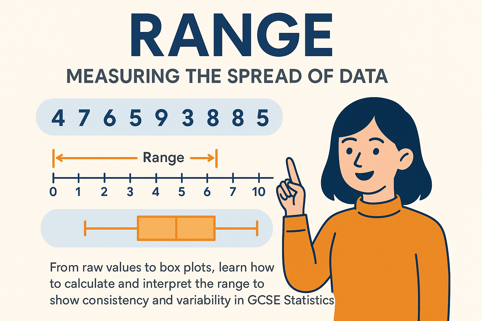
Range is a simple yet important measure of data spread in GCSE Maths. This subcategory teaches learners to calculate the difference between the largest and smallest values, interpret variability, a...
Pictograms use images or symbols to represent data, making it visually accessible. This subcategory teaches students to interpret, construct, and scale pictograms accurately. Step-by-step examples ...
Bar charts are key for displaying and comparing categorical data in GCSE Maths. This subcategory teaches students how to construct, read, and interpret vertical and horizontal bar charts, including...
Pie charts help students represent data as proportional segments in GCSE Maths. This subcategory teaches how to calculate angles, construct accurate charts, and interpret percentages visually. Step...
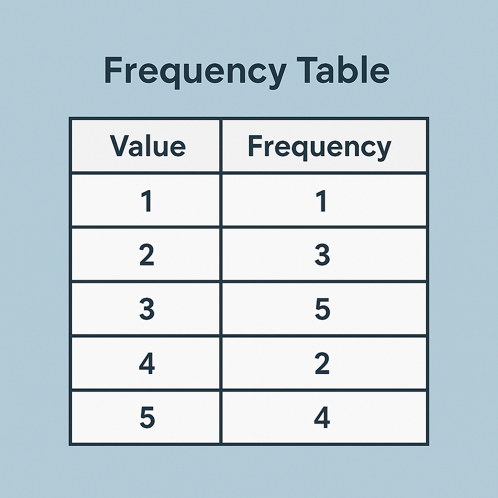
Frequency tables are a fundamental tool for organising and analysing data sets. This subcategory teaches students to create tables, group data, calculate totals, and interpret patterns. Step-by-ste...
Histograms are essential for displaying continuous data in GCSE Maths. This subcategory teaches students to construct, read, and interpret histograms, understanding frequency density and class inte...
Cumulative frequency is a method for understanding data accumulation and distribution. This subcategory teaches students to calculate cumulative totals, construct cumulative frequency tables and gr...
Box plots provide a visual summary of data distribution, highlighting medians, quartiles, and extremes. This subcategory teaches students to construct, read, and interpret box plots accurately, inc...
Scatter graphs are used to explore relationships between two variables in GCSE Maths. This subcategory teaches students how to plot points, interpret correlation, and identify trends or anomalies. ...
Sampling is a key concept in statistics, teaching students how to collect representative data sets. This subcategory covers different sampling methods, including random, stratified, and systematic ...
Questionnaires are an essential tool for gathering data in GCSE Maths. This subcategory teaches students to design effective questions, structure surveys, and collect accurate information while avo...
Misleading graphs teach students to critically evaluate visual data representations in GCSE Maths. This subcategory explores common ways graphs can distort information, including scales, omitted da...
Learn how to build, interpret, and apply frequency tables to estimate the mean, median, mode, and connect data to histograms, cumulative frequency graphs, and box plots.
From raw values to box plots, learn how to calculate and interpret the range to show consistency and variability in GCSE Statistics.
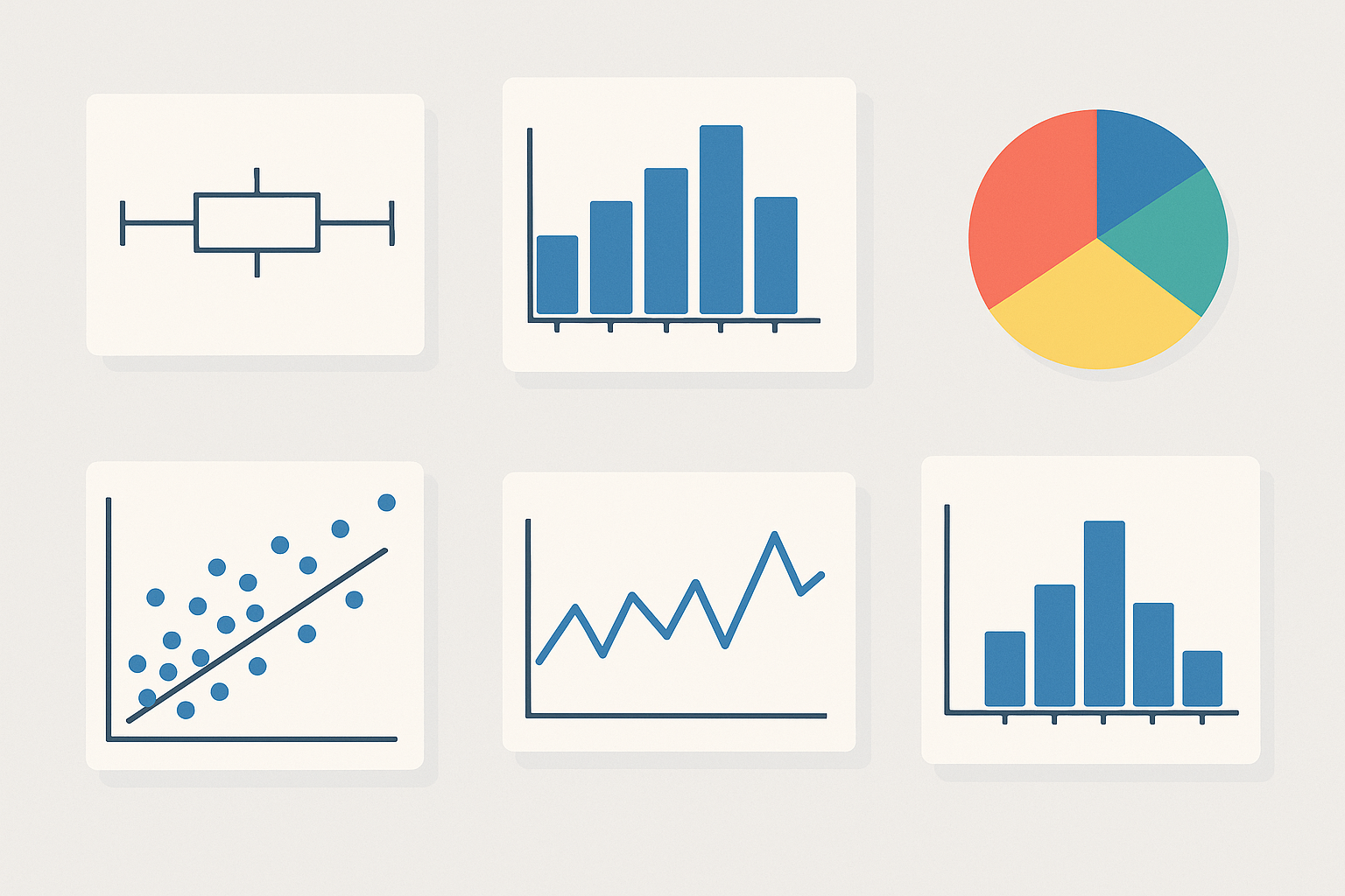
Master bar charts, pie charts, histograms, box plots, scatter graphs, and more to understand, compare, and interpret data at GCSE level.
We use cookies to improve your experience. Read about our Cookie Policy