Bar Charts Quizzes
Visual overview of Bar Charts.
Introduction
Bar charts are one of the most common ways to represent data visually in GCSE Maths. They provide a quick and clear method for comparing quantities across different categories. Whether you are analyzing survey results, exam scores, sales figures, or experimental data, bar charts allow you to spot patterns, differences, and trends effectively. Developing a solid understanding of bar charts not only helps with data interpretation in exams but also builds essential problem-solving and analytical skills.
Core Concepts
What is a Bar Chart?
A bar chart represents data using rectangular bars. Each bar’s height (vertical) or length (horizontal) is proportional to the value it represents. One axis shows the categories, while the other shows the values. Bar charts make it easy to compare categories at a glance.
Key Features
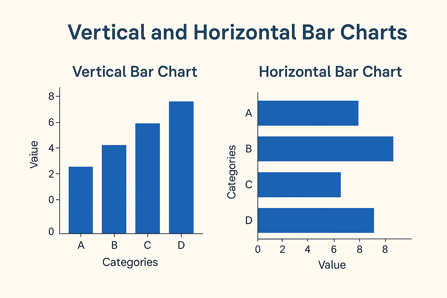
- ✅ Orientation: Bars can be vertical or horizontal depending on the data and readability.
- 📏 Proportional: The height or length of each bar represents the quantity or value of the category.
- 📐 Spacing: Bars should be equally spaced and have consistent width.
- 🏷️ Labels: The chart must include a clear title and labeled axes.
- ⚖️ Scale: The value axis should have a consistent and appropriate scale for the data range.
Rules & Steps to Draw a Bar Chart
- Identify the categories and their corresponding values.
- Choose a suitable scale for the value axis (e.g., 1 cm = 5 units).
- Draw each bar with height or length proportional to its value.
- Label the axes and give the chart a descriptive title.
- Double-check that all bars are evenly spaced and proportional to their values.
Worked Examples
-
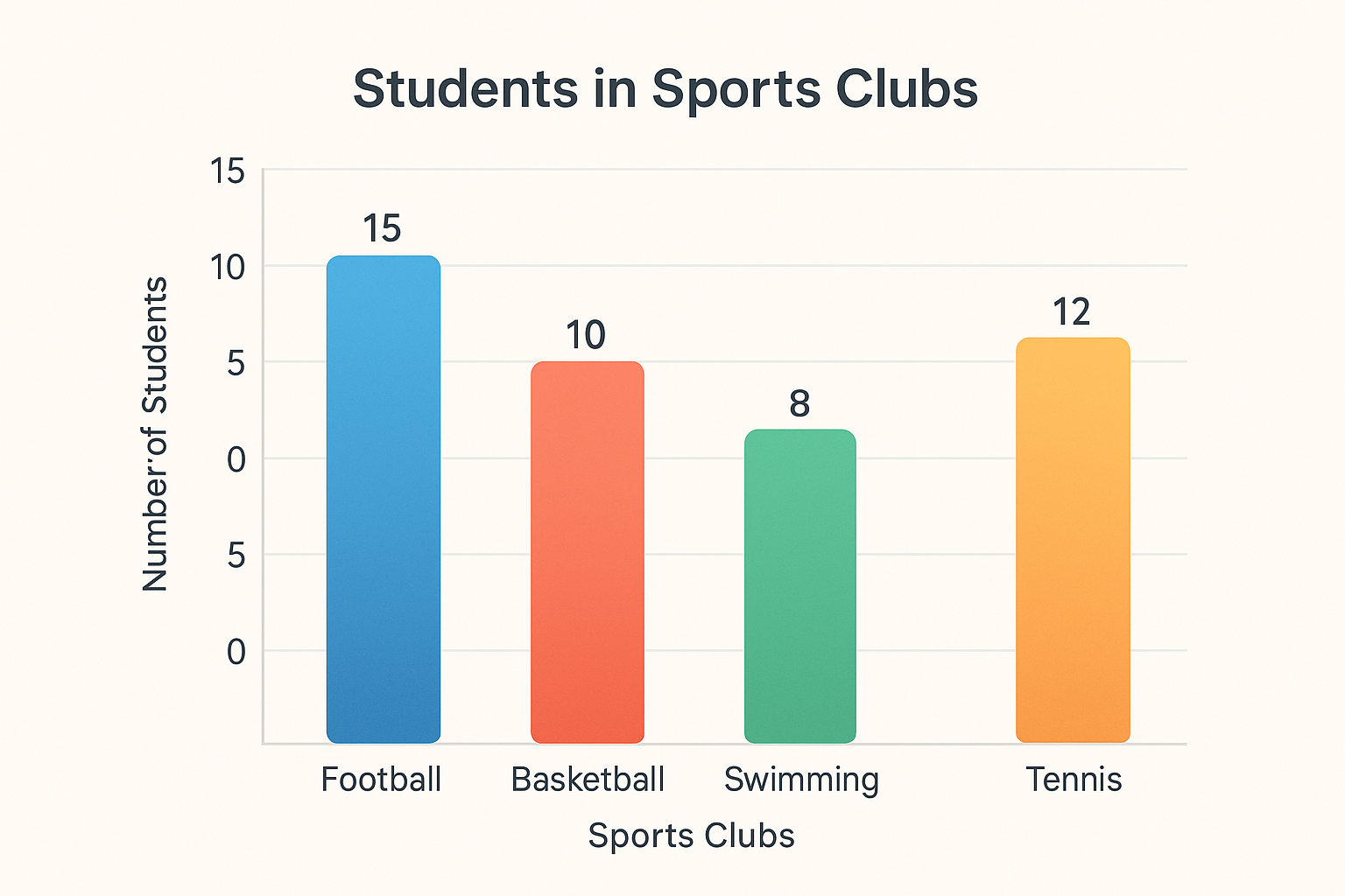
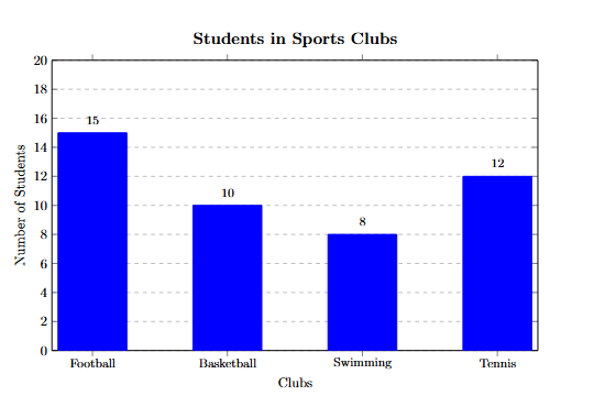
Example 1: Number of students in different sports clubs:
Football: 15, Basketball: 10, Swimming: 8, Tennis: 12
Steps: Choose scale 1 unit = 1 student → Draw vertical bars → Label axes → Title: “Students in Sports Clubs”
-
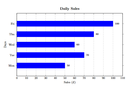
Example 2: Daily sales (£) of a shop over 5 days:
Mon = 50, Tue = 70, Wed = 60, Thu = 80, Fri = 100
Steps: Scale 1 cm = £10 → Draw bars: Mon = 5 cm, Tue = 7 cm, Wed = 6 cm, Thu = 8 cm, Fri = 10 cm → Label axes: Days (x-axis), Sales (£) (y-axis) → Title: “Daily Sales”
-
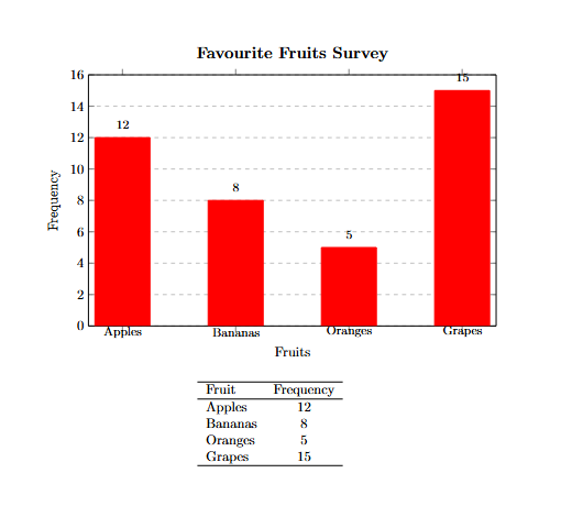
Example 3 (Higher Level – Using Frequency): Favourite fruits survey:
Apples = 12, Bananas = 8, Oranges = 5, Grapes = 15
Steps: Choose scale 1 unit = 1 response → Draw bars proportional to frequency → Label axes → Title: “Favourite Fruits Survey”
Common Mistakes
- Incorrectly scaled bars (heights/lengths not proportional to values).
- Bars unevenly spaced or with inconsistent width.
- Missing axis labels or chart title.
- Using a scale that misrepresents the data.
- Confusing vertical and horizontal axes.
Applications of Bar Charts
- Surveys: Quickly visualizing responses to questionnaires.
- Business: Comparing sales, profits, or customer counts across categories.
- Education: Comparing exam results, attendance, or participation.
- Science: Representing categorical experimental data or observations.
Strategies & Tips
- ✅ Always select a scale that fits your data neatly on the chart.
- 📏 Ensure bars are proportional to the values they represent.
- 🏷️ Label all axes clearly and provide a descriptive chart title.
- 📊 Use vertical bars for most categorical data; horizontal bars can improve readability for longer category names.
- 🔍 Practice interpreting bar charts to answer questions about totals, differences, and comparisons.
- 👁️ Check your chart visually – the tallest bar should match the highest value.
Summary
Bar charts are a simple and effective method to visualize categorical data. Remember:
- 📊 Bars represent categories; their height/length represents values.
- 🏷️ Include a clear title and labeled axes.
- ⚖️ Maintain a consistent scale and proportional bars.
- 📝 Practice drawing and interpreting bar charts for stronger analytical skills.
Mastering bar charts will help you summarize and interpret data quickly, spot trends, and solve exam problems efficiently. Reinforce your learning by attempting the quizzes in this subcategory!